In 2017, what is now called Bindable, was having an identity crisis. The company, founded as MassDrive, had grown rapidly with a 'we can fix this later' attitude towards branding. We were known as either MassDrive, Next Generation Insurance or MyLifeProtected depending on when and under what context you introduced to us. As we were making our push into the technology services space with Policy Crusher, 'fix this later' was finally upon us. As conversations started about which of the three 'established' brands we wanted go with, I suggested a total rebrand. The timing was right and there was a clear need to start fresh from a branding perspective.


Bindable came to me through some idea mapping and works on a few different levels. The companies main source of leads at the time was through affinity marketing. A group of people bound together through a common interest, affiliation or trade. With our shift into tech services, the industry term 'bind' makes perfect sense, as our products were meant to help customers and agents get to their 'bindable' quote.
I didn't want Bindable to look like every other insurtech out there. The use of red was a deliberate choice (albeit not a popular one with the CEO) to stand out from the blue green sea of insurtech logos. The script typeface was chosen to give the whole logo a sense of roundness that I feel speaks to the warm, friendly nature of the identity.
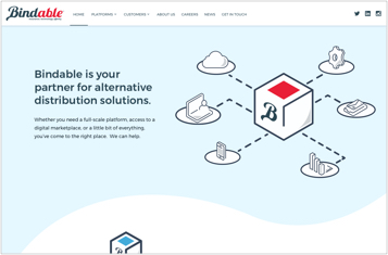
The first version of the Bindable website was put together in a fews days leading up to a major press release. It got the job done, but never truly served the brand the way it should. In 2019 we decided to fix that with a fresh design and a better organized set of products. We had found with the previous iteration of the site that we knew what we did, but it wasn't exactly clear to people with whom we didn't have an established relationship. As we tried to hammer out our product suite, we found ourselves talking in circles. I decided to organize all our products and services into four buckets that became the Bindable Platform. A little something for everyone, but with enough wiggle room in each description to allow us to customize each implementation as we always had.
When it came time to design the site I had an oddly difficult time getting anything into Sketch that I actually liked. I had trapped in myself into the hero image pattern and needed to get out. I decided to take a markedly different approach to the design this time and exclude photographs from the main content pages. Getting into Illustrator and working through the product concepts ended up being the catalyst I needed to finally get a site design I was pleased with.