InnSure
InnSure was building a SaaS product for the first time, with no UX background on the team. A former boss and mentor of mine, now advising InnSure, brought me in to look at what had already been built before real users ever touched it.
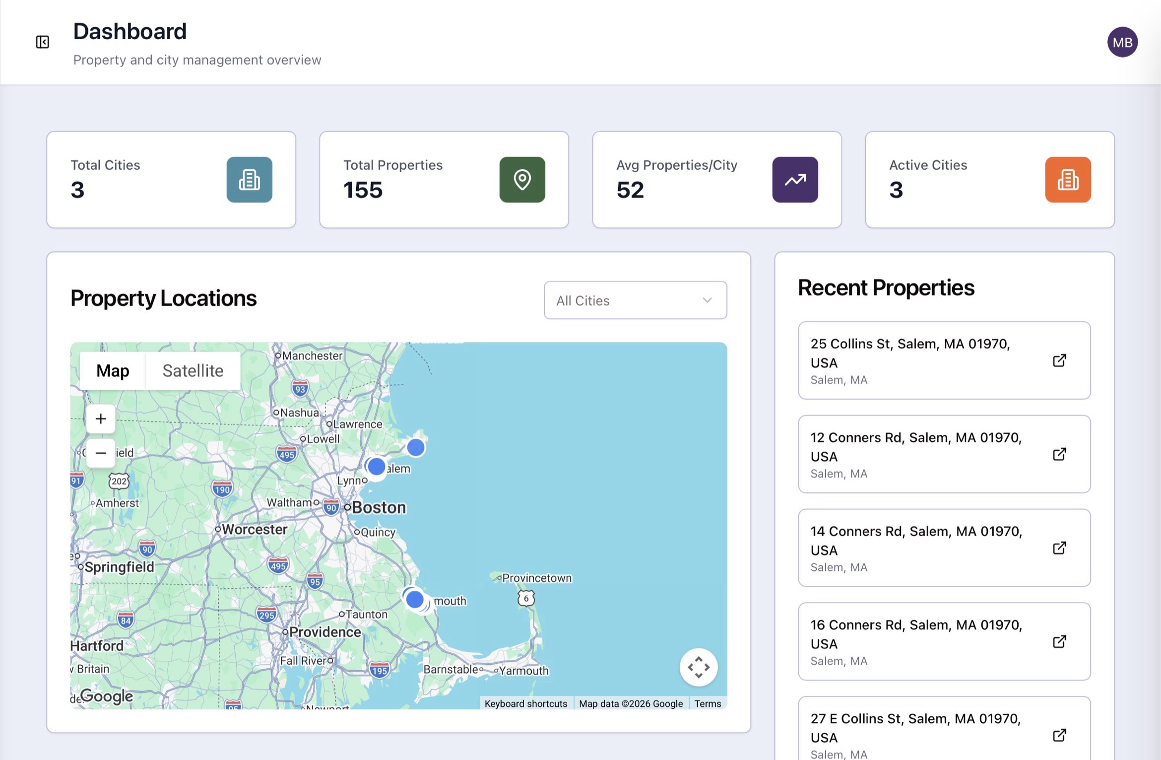 The portfolio overview. The counts set the scale before any single property does, and every row in the list carries its city so the map and the list never have to be read against each other.
What the audit covered
I started with the people who built the product, then used it the way their core audience would.
Interviews came first: sitting down with the team that built the platform to understand their assumptions and constraints. Then I ran a cognitive walkthrough as the platform's core user, a single city municipal admin, to find where those assumptions turned into real gaps for the people InnSure is actually trying to serve.
What I found
Admin creep
The top-level IA, navigation defaults, and some controls were built for a multi-city admin. A single-city municipal user gets treated as a drill-down within that structure, instead of having a purpose-built home of their own.
Data integrity and trust
Several stat counts didn't reconcile across screens, and some figures depended on outside context to be trustworthy, a real problem for a user who has to defend those numbers in public.
Interactivity and affordance gaps
Elements that looked interactive weren't, and vice versa. The same pattern was interactive in one place and static in another, with no consistent signal either way.
Polish on the analytical tabs
The product's strongest screens shared four contained issues: unformatted numbers, pages that ran too long, unlabeled semantic color, and pill styling that sometimes misled more than it clarified.
Outcome
The audit became a report that put a name to blind spots the internal team couldn't see from the inside. InnSure moved it straight into their AI native workflow to start remediating the issues. The work held up well enough that the relationship didn't end there. I've since taken on UI/UX for the platform they're standing up, shaping the product as it's built.