Bindable Rebrand
Bindable was pivoting from affinity marketing to insurance technology, and the current brand Next Generation Insurance Group didn't tell that story. I led the rebrand, mark, type, color and voice, then wrote the style guide and built the assets that let it hold together across products, partner sites and every deck the company sent out.
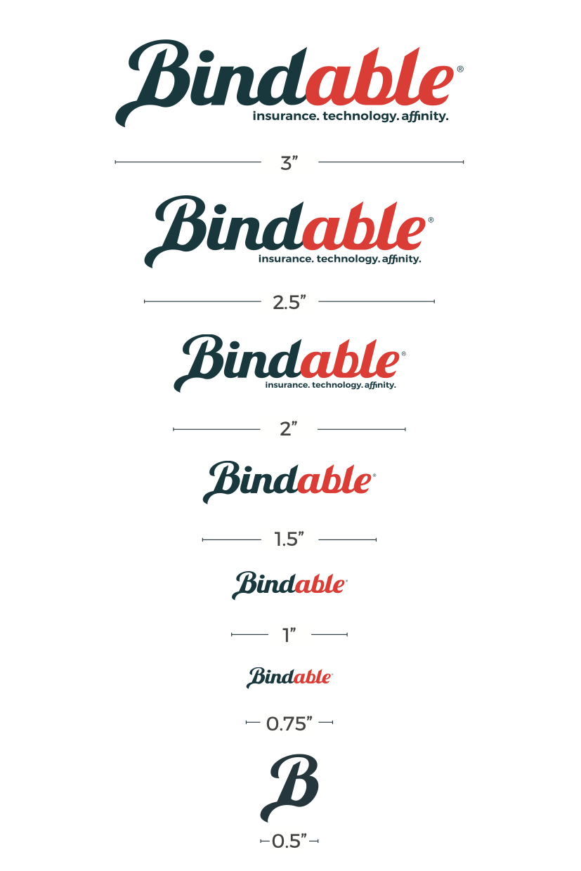 The wordmark, with the minimum sizes and clear-space rules that came with it.
The problem
We didn't need a prettier logo. We needed a system that could travel.
The brand still said affinity marketing while the company had become a configurable insurance-tech platform. Visuals, voice and interface didn't carry between products or partner experiences, and they were using several brands in market at the same time, so every launch reopened decisions that should have been settled once.
The work
Refresh the mark
A reworked logomark and wordmark, and a voice written for enterprise buyers rather than a consumer marketplace.
Write it down
Clear space and minimum sizes, lockups for the product lines, color with semantic roles and contrast minimums, a responsive type ramp and a spacing scale. The things teams argue about, decided once and documented with do and don't examples.
Sell it upstairs
None of it ships without executive sign-off. I built the case and presented it to leadership, telling the pivot story first and the design second. A rebrand is a business argument before it's a visual one.
Roll it out
A coordinated site refresh, brand lockups for the product lines including Policy Crusher, and starter kits so marketing and sales could produce on-brand material without me in the room.
Identity
Logomark and wordmark with clear-space rules and minimum sizes, lockups for the product lines and for events, and voice and tone written for an enterprise audience.
Brand tokens
A color palette with semantic roles and minimum contrast ratios, a type ramp with responsive steps, and a spacing scale with grid, elevation and motion.
Style guide & assets
An icon library, documented usage with do and don't examples, and deck templates and starter kits for the people producing day-to-day material.
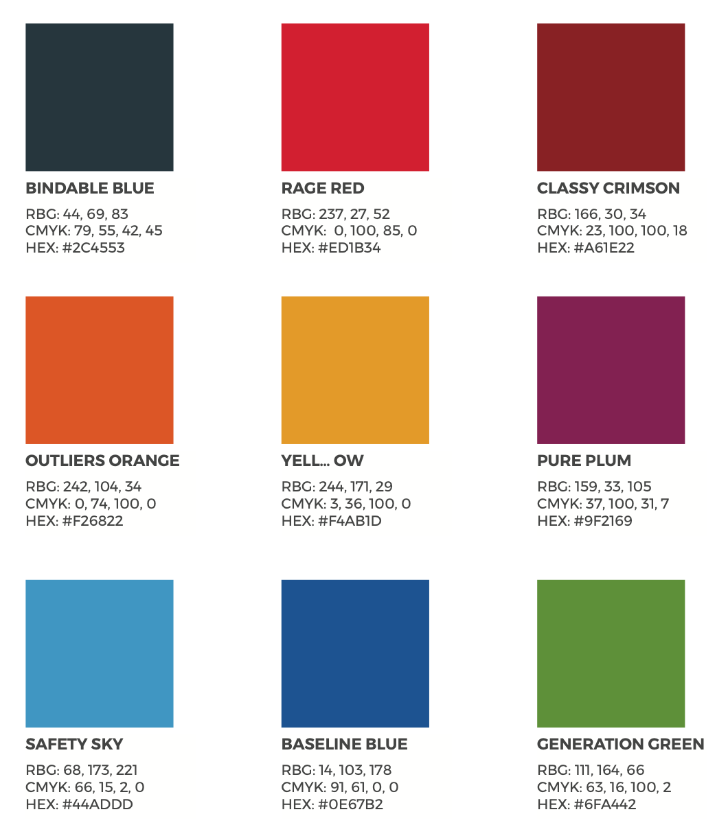 The palette. Every color named, specified three ways, and given a job, so nobody has to eyedrop a PDF.
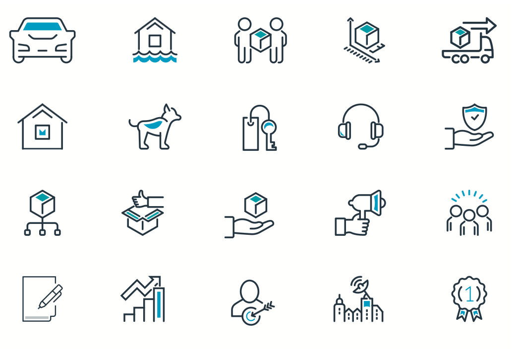 The icon library, drawn to one set of rules so the twenty-first icon looks like it belongs.
Impact
One platform story that holds from a marketing page through to a product screen. Partner launches got faster because fewer things had to be settled from scratch each time, and naming an owner for the system meant the one-off debates largely stopped.